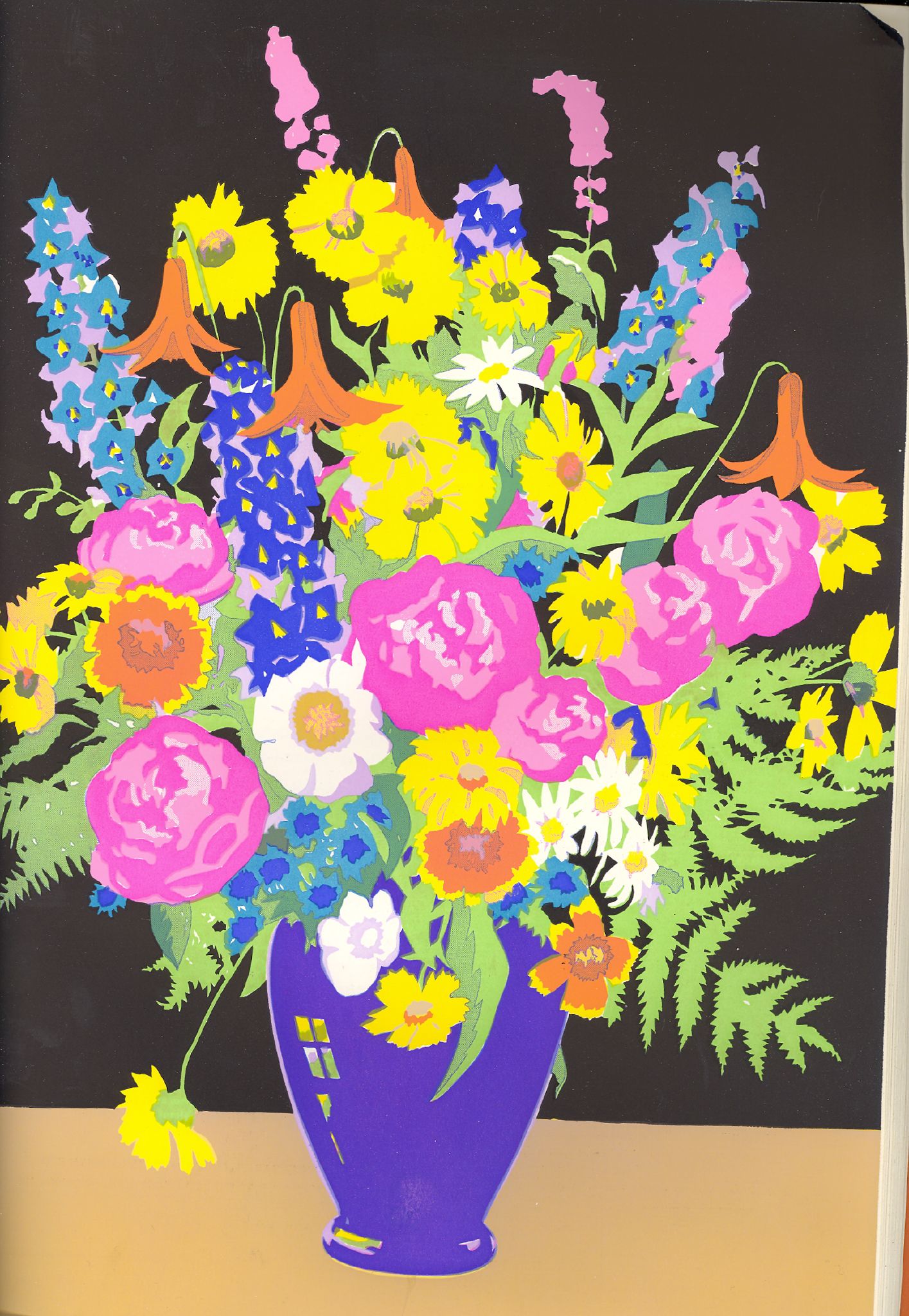
As a part of an art project I'm doing on the side, I've been researching on means to put letterpress to use in more complicated ways. I've been particularly interested in coming up with a way to print process color using a letterpress, as supposedly when the transparent ink process was first being used, it was occasionally done on a letterpress.
"Process" color is now commonly known as CMYK. This stands for each of the principle inks used in the printing run: Cyan, Magenta, Yellow, and blacK. The letter "K" is used for black so as not to confuse it with "B" for blue. The letters also stand for the order in which ink is applied to paper: first, Cyan, then Magenta, Yellow, and finally blacK. Sometimes, in order to compensate for a variety of issues, you might see the order listed differently, for example: KCMY, YCMK, etc. None the less, it is all "process" color.
Unfortunately, even when everything is running perfectly, CMYK cannot reproduce a large number of colors. Without getting technical, in order to compensate for this, a system was invented by Pantone in the 1990's called Hexachrome, which added Orange and Green to the process colors. Green and orange are notoriously difficult to reproduce in CMYK process.
However, in search of ways to print CMYK on a letterpress, I discovered a printing process that emulates the concept of Hexachrome seventy years before Hexachrome was invented. This process was called "The Berté Process." It used watercolor ink and overprinted solids. I wasn't familiar with this process before, and I'm amazed at the quality of the color that was possible. Take a look:
Sunday, November 1
Subscribe to:
Post Comments (Atom)


1 comment:
From the stunning bouquet I’d say it is well worth the time and expense and all that from four colors. It is very beautiful.
Take care
Post a Comment