Showing posts with label Letterpress. Show all posts

Sunday, July 11

The Laws and Liberties of Massachusetts - 1648

Ryan's post about the printing of the Declaration piqued my memory about printing and ancient (by American commonwealth government’ standards) texts. As a result, I’ve written an article about a book I recently picked up, an effort that required quite a bit of research. We hope you enjoy it.

Two weeks ago, in one of my favorite rare and used book stores, I happened across a reprint of The Laws and Liberties of Massachusetts from 1648. The reprint was set in the best possible reproduction of the original typeface and retained the grammar, spelling, and ligatures. More importantly, this book codified the first set of rights in New England and served as a foundation for all future U.S. law. Some of the content taken verbatim from the Liberties exists to this day, like the oath taken before giving evidence at trial, “I solemnly swear to tell the truth, the whole truth, and nothing but the truth, so help me God.”

The content is fascinating; colonial Massachusetts was a strict and harsh place. The "Capital Laws" were numerous and you could be executed for just about any offense you can imagine, no matter how frivolous (by today's standards). I knew very little of publishing in that period, nor did I know anything of the book’s own history.

Cover of the Laws and Liberties, Stinehour Edition

The edition of my book was printed by Stinehour Press, in Vermont, on Finch Vanilla Opaque Text, using a redrawn version of Caslon to come close to the original Leyden Roman style. Sadly, Stinehour Press, a well-known artisan printer has since gone out of business. The book is a beautiful reproduction. The history of the original text is far more complex.

The Massachusetts colony, according to some reports, only had about four printers in the 17th century and even this is not clear. The last remaining intact copy of the Liberties was purchased in 1911 by Henry E. Huntington whose library was responsible for providing the original to the Harvard University Press for its facsimile publication in 1929.

The original edition was published during a fascinating time for print and the early European immigration to the Americas. Before we go on, we must take note of the technology and migratory timelines involved in our story. Our book, The Lauus and Libertyes of Massachusetts, was printed in 1648. The Mayflower had arrived only twenty eight years earlier, in 1620. Shakespeare had died a mere four years before that, in 1616. The printing press had been mechanized by Joannes Gutenberg two hundred years earlier. The American Revolution would not occur for another one hundred twenty seven years.

Much has been been written about the difficulties of life in the early Massachusetts Bay Colony, a history of hardship that is responsible for the American holiday of Thanksgiving. Goods brought to the colonies used precious cargo space on the small ships that endured a treacherous journey across the violent and fickle Atlantic ocean. In the first year of settlement, nearly half the colonists died. This new wilderness spurned many myths and popularized the adventures of the pilgrims in England, particularly through the publication of a pamphlet called Mourt’s Relation.


Frontispiece of Mourt's Relation, via Wikipedia.org

It was in this environment that a minister, the Rev. Joseph Glover, from Surrey, decided to leave his post in England and embark with his family on a journey to the Massachusetts Bay Colony. Unfortunately for the Reverend, the journey had grown no less dangerous in the two decades since the original settlement, and in attempting to cross the ocean in 1638, he fell ill and died. In the histories written by his family, he brought along with him, besides his family, a printing press intended for Harvard College in Cambridge, Stephen Daye whom was a “printer” and three servants who were bound to work the press. This press was destined to be the first printing press in America.

The Cambridge Press was established in 1639, using the “Daye Press,” the press operated by Stephen Daye thanks to the shipping of the (then deceased) Rev. Glover. Our story becomes more curious as Stephen Daye was not a particularly good press superintendent, though he was said to be a descendant of the typographer John Day. His spelling, punctuation, and typography were generally poor. His first work, the Freeman’s Oath, was purportedly less than impressive as a work of art, but served as the foundation for the entire history of American printing. Unfortunately, that original broadsheet, printed in 1639, has long been lost to recorded history (though the oath remains).

This brings us to three questions: who published The Lauus and Libertyes of Massachusetts, who printed it, and what press was it printed on?

Records indicate that given the timeline, production in 1647 for the Cambridge press was done by Samuel Green, under the authority of Henry Dunster, the first president of Harvard University (then Harvard College). The Daye press, the one established by Daye in honor of Rev. Glover, was apparently still the only press in use. So, we can answer the three questions definitively but one curiousity remains: what did the Daye press actually look like? The Laws and Liberties are set with a complex number of glyphs, strange ligatures, and tildes that dot the text, as do beautiful scrollwork and rules. The collection of type was clearly sophisticated.

The "Capital Laws" Section of the Liberties

According to a citation of the Cambridge Historical Society, this is an image of the press itself:


Image of the Daye Press, attributed to the Cambridge Historical Society

It’s hard to imagine the experience that these individuals undertook in the name of print. The colonies were difficult frontier to trespass, a place where no luxury was permitted. It is in this place, with no more than 2000 colonists, that the foundations of the modern press and the world of publication were poured. Rev. Glover died in his attempt to ferry a press to the new world, his debtor Stephen Daye carried forth the press and tradition without him, and under the authority of the General Court of Massachusetts, the first set of rights were published in New England.

Through time these ideals and documents were carried and in 2010, three hundred sixty two years after its publication, I bought a beautifully printed edition of The Laws and Liberties of Massachusetts for ten dollars in a used bookstore. If this doesn’t underscore the legacy of print and the fundamentals of communication in America, nothing does. As book publishing and print wane in our new digital age, it will be easy to forget the centuries of history, blood, and ink that make up our very social fabric. At the least, the next time I use my iPhone, I’ll think of Stephen Daye and Rev. Glover, without whom our modern communication conveniences might never have existed.

Sunday, June 27

Letterpress Calendars

I must admit, there is a very soft spot in my heart for letterpress, particularly the style of printing that is popular now; soft papers and deep impressions. The popularity of using letterpress in this way is a fascinating development of the technology. Where historically a letterpress might be used to simply print, the presence of a myriad of cheap print technologies have pushed pressmen to use old technology in new ways, or at least redefine the boundaries of good technique.

This past year I saw a huge increase in letterpress calendars and one of those that caught my eye was a collaborative piece by Studio on Fire. The idea of collaborative design is really exciting, particularly in a digital age where designs can easily be shared and ideas worked out long before makeready is started. There's no doubt that work like this isn't cheap; I know only a few people whom still keep a physical calendar and buy them from office supply stores for a few bucks. However, it's always struck me odd that people spend a great deal of money outfitting their homes with expensive furniture and decorations but then ignore the commodity items that truly fill the space.

So, while this calendar sold for $30, it seems like a reasonable price to me. Think not of it as something you buy and throw away, but rather, a work of art that refreshes itself monthly for a year. Many people wouldn't blanch at spending $30 on a single meal, an experience that lasts only a few hours. $30 on an experience that lasts 365 days seems like a deal.

Take a look and take note of the wonderful color. Near neutrals and orange are just about impossible to hold in a four color offset process, using solids on a letterpress provides a specificity of color that is so hard to match. The next time I buy a calendar, I'll certainly be looking for individually produced, short-run works of art. It's a lot more fun than a generic photo or office calendar.


Image ©2010 Studio on Fire

Image ©2010 Studio on Fire

Image ©2010 Studio on Fire

Image ©2010 Studio on Fire

Sunday, November 1

Four Color Letterpress

As a part of an art project I'm doing on the side, I've been researching on means to put letterpress to use in more complicated ways. I've been particularly interested in coming up with a way to print process color using a letterpress, as supposedly when the transparent ink process was first being used, it was occasionally done on a letterpress.

"Process" color is now commonly known as CMYK. This stands for each of the principle inks used in the printing run: Cyan, Magenta, Yellow, and blacK. The letter "K" is used for black so as not to confuse it with "B" for blue. The letters also stand for the order in which ink is applied to paper: first, Cyan, then Magenta, Yellow, and finally blacK. Sometimes, in order to compensate for a variety of issues, you might see the order listed differently, for example: KCMY, YCMK, etc. None the less, it is all "process" color.

Unfortunately, even when everything is running perfectly, CMYK cannot reproduce a large number of colors. Without getting technical, in order to compensate for this, a system was invented by Pantone in the 1990's called Hexachrome, which added Orange and Green to the process colors. Green and orange are notoriously difficult to reproduce in CMYK process.

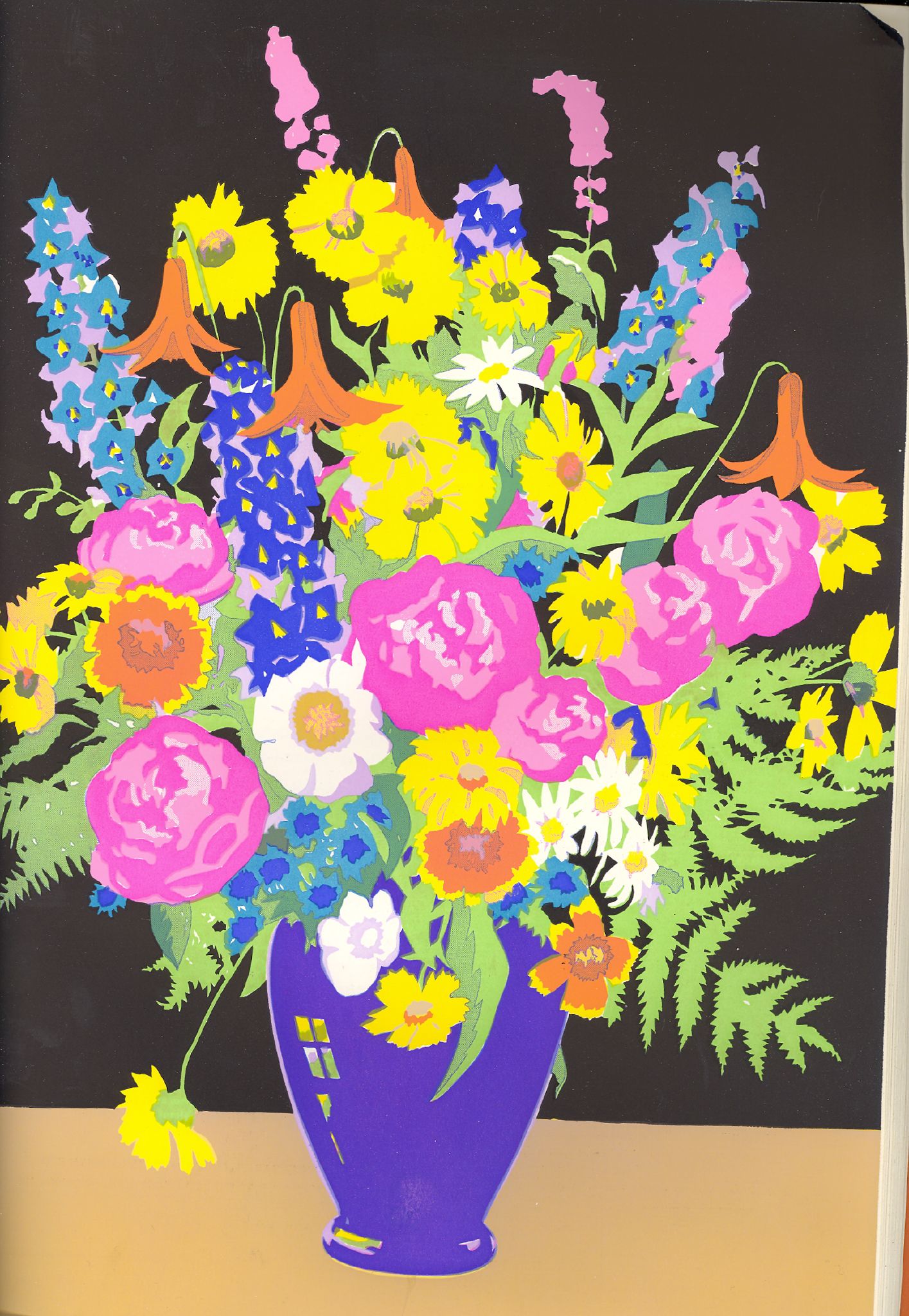
However, in search of ways to print CMYK on a letterpress, I discovered a printing process that emulates the concept of Hexachrome seventy years before Hexachrome was invented. This process was called "The Berté Process." It used watercolor ink and overprinted solids. I wasn't familiar with this process before, and I'm amazed at the quality of the color that was possible. Take a look:


It would be really interesting to revive this type of printing on the letterpress (though it would be outlandishly expensive). Though you would not be able to easily reproduce gradients (seamless transitions between two different colors), you could create a variety of stunning effects.

Wednesday, August 12

More Kate Spade!

Emily mentioned Kate Spade's looks today and I just had to quickly add that our merchants brought in Kate Spade's designs from Crane & Co. Check a few of these out, they're wonderful:

Adorable Hedgehogs for Family Announcements...
I love the blind embossed Kate Spade logo.


Crane & Co. always knocks it out of the park when
it comes to engraving. Combined with Kate Spade's sense of style,
it's very cute without being frou-frou or ironic.


As a man, it's nice to see the occasional
androgynous/masculine design in stationery.
It needn't be chauvinistic to be strong.


I love this style. It reminds me the best of the Ralph Lauren editorial
and advertising photography/styling from the late 1990's (not at all an insult -
Ralph Lauren went public in 1997, one of their more successful years).

I really like how Kate Spade and Crane & Co. have found a nice synthesis between using modern design and paying homage to classic typefaces. It's interesting to see how Kate Spade carries their sense of design through all of their product, be it fashion or paper.

Tuesday, April 21

Found in eInvite's 25% Off Spring Sale


There are some real gems in eInvite's Spring Sale - last day today: wedding invitations with multiple layers and ribbons at deep discounts, stunning letterpress invitations, thank-you notes, party and baby, too. The white foil text on the rich black paper of Beauty in Black sets a formal tone for an evening event and lets brights colors stand out even more. The letterpress invitation Field Flower in summery tones of yellow and green calls to mind margaritas and lemon-hued orchids (found on theknot.com). Take advantage of great sale prices and browse lots of other new invitations on eInvite!

Monday, March 16

Feelin' Green

In honor of St. Patrick’s Day (Tues) and the official start of spring (Fri), I would like to highlight some of my favorite green wedding products on eInvite.com.

{L to R from top: Elegance by eInvite.com, Letterpressed Vine Invitaion by Crane & Co., Leg Poppin’ Proposal- Magnet by Carlson Craft, White Wildflowers Photo by eInvite.com, Fallen by McPhersons, Fab Beads Lime by Inviting Co.}

Thursday, November 20

Variety is the Spice of Life!

Ever find yourself in a last minute frenzy searching for a birthday card, or know of someone who continuously shows up to parties without one? Many times I’ve hurried out the door with the perfect gift, just to realize I don’t have a card to accompany it. In these situations, I often wish I had something on hand, tucked away at home, for that special occasion. Lucky for me and for fellow procrastinators alike, eInvite sells all-occasion greeting card packs! Not only are these lovely assortments practical, they’re beautifully designed and illustrated as well. Check out this Greeting Card Variety Pack by Hello! Lucky.

Containing 18 greeting cards, this pack features nine fabulous designs that are perfect for any occasion. Each cream fold-over card is blank inside and hand-printed on an antique letterpress. This pack is quality, function and fun all-in-one! An excellent choice for the mod chic who is always on the go.
Equally as marvelous is the Wild Jungle All-Occasion Pack by Red Cap Cards.


This pack of 25 cards, features five charming illustrations by Carrie Gifford that include appropriate phrases such as "Happy Birthday," and "Thank You.” Suitable for all occasions, each card is printed on cream paper and is blank inside. This assortment is anything but ordinary, making it a great gift for even the most eccentric of friends.
So, whether it be a gift to yourself, or for that special procrastinator in your life, these variety packs are the perfect little something for the up and coming holidays. Put an end to last minute shopping and be sure to check out these and similar products at eInvite today!

Sunday, November 16

Loving Letterpress


Letterpress is truly luxurious. It has existed around the world for the last six hundred years, and is a diverse printing method today. Some letterpress shops use traditional hand-fed presses, while others use polymer forms and rotary presses. Both can create exceptional results, but you should expect to pay more for a boutique, hand-fed letterpress printer.

I love letterpress because it celebrates a rich heritage of craftsmanship and is easy to recognize. I happen to like a very deep impression into heavy paper stock, a method that has broken with tradition.

A good printer can work with small serifs and show off exceptional technique by not allowing ink to fill impressions and lose detail.

Letterpress is the right choice when you want to celebrate a certain amount of decadence. You might say that it is the truffle of printing methods!