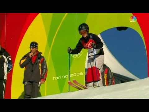
The torso is higher and therefore more easily seen by the judges. As a result, in order to draw the eye downward, bright patches are placed over the knees, and solids tend to cover the torso. I was very surprised at how utilitarian the U.S. team's suits were. They were not particularly good looking, and functionally achieved their purpose (you noticed the knees and didn't focus on the torso). They looked a bit like they were wearing pajamas in royal blue with star print.
This lack of flair (in the suits - the skiers themselves compensated magnificently) made me wonder if perhaps the design had been significantly influenced by the economic morass in the United States. Is our collective emotional state influencing our cultural representation? Ralph Lauren designed the ready-to-wear collection that you see U.S. Olympians wearing on the podium, and this sort of pattern does remind me a bit of his style, but I could not find if he was responsible or not.
What do you think? Is our stoic presentation due to our current economic environment? Or do you think that the design above is just as bombastic as previous U.S. Olympic designs? See below:

I feel like our presentation on the world stage is a reflection of our emotional state as a country (and I couldn't help but overhear my compatriots this weekend remarking about the lackluster economy and the rising Chinese star). It's fascinating to think of a cultural subconscious having such an effect on art and design.


3 comments:
It's interesting contrasting the skiing uniforms with the ones Burton did for the snowboarding team: http://www.highsnobiety.com/news/2009/12/05/burton-2010-u-s-snowboarding-team-olympic-uniform/
But both reflect an everyday-ness,an everyone is a regular joe feeling that is prevalent right now.
Side note - I love highsnobiety. It's interesting to see the Western world's ennui (oh yes I did) in comparison to the enthusiasm in the East. Not that it's easy to divide the world into hemispheres, but there's clearly a different set of problems and emotions between the parts of the world that are seeing growth and the parts of the world that aren't.
I agree with A that the ski fashion belonged under the covers...bleh. You need edge and sophistication and the all over star pattern looked like your brothers flannel comfies. On the other hand, Alita nailed it...Burton's "anti-uniform" was not a fav of mine, until I saw it in action in snowboard cross. I liked it and went so against my initial opinion. Still not a huge fan of the plaid, on this or anything, but the racing jacket and the jean like image of the pants really worked and conveyed the whole rebellious nature of snowboard culture. You definately don't want to look like a skier if you are on a board! Love your post and looking forward to more as the week unfolds with other events...
Post a Comment