{images: gazebo and the 4th banner marthastewart.com, porch: bhg, patriotic room: colorfulkidsrooms.com, desserts: celebrations.com, cocktail: coastalliving.com, fireworks: proteinpower.com}
Erin's post on nautical inspiration got my wheels spinning with red, white and blue sparks...about this weekend at the beach.
Things are getting festive all over town. As we approach the 4th of July holiday weekend here in Massachusetts, you begin to see homes decorated in patriotic colors. I love this time of year. Thoughts of Cape Cod, children with flags, sack races, boats adorned in red white and blue, festive cocktails and desserts, and rock-us celebrations of fireworks. Oh, and the Boston Pops and the Esplanade for those Boston "Patriots" make this weekend one of my top weekends of the year.
Have a fun, safe and sparkly 4th of July!
Wednesday, June 30
Monday, June 28
Anchors Away!
Nautical inspiration is everywhere this season. I am particularly smitten with stripes, but love the idea of throwing an anchor-inspired event. The charm bracelet would be an adorable bridesmaid gift!
{L to R from the top: Anchors Aweigh Invitation from Paper Orchid; Betsey Johnson 'Under the Sea' Multi Charm Toggle Bracelet; Anchor w/Chain from Meri Meri; Rampage Women's Rayanne Sandal; Dockside from Checkerboard, Ltd.; ASOS Collection Anchor Necklace; Anchor with ropes from Checkerboard, Ltd.; Sea Bags; Green Anchor from eInvite.com}
Labels:
inspiration,
Party,
trends,
wedding,
wedding invitation
Sunday, June 27
Letterpress Calendars
I must admit, there is a very soft spot in my heart for letterpress, particularly the style of printing that is popular now; soft papers and deep impressions. The popularity of using letterpress in this way is a fascinating development of the technology. Where historically a letterpress might be used to simply print, the presence of a myriad of cheap print technologies have pushed pressmen to use old technology in new ways, or at least redefine the boundaries of good technique.
This past year I saw a huge increase in letterpress calendars and one of those that caught my eye was a collaborative piece by Studio on Fire. The idea of collaborative design is really exciting, particularly in a digital age where designs can easily be shared and ideas worked out long before makeready is started. There's no doubt that work like this isn't cheap; I know only a few people whom still keep a physical calendar and buy them from office supply stores for a few bucks. However, it's always struck me odd that people spend a great deal of money outfitting their homes with expensive furniture and decorations but then ignore the commodity items that truly fill the space.
So, while this calendar sold for $30, it seems like a reasonable price to me. Think not of it as something you buy and throw away, but rather, a work of art that refreshes itself monthly for a year. Many people wouldn't blanch at spending $30 on a single meal, an experience that lasts only a few hours. $30 on an experience that lasts 365 days seems like a deal.
Take a look and take note of the wonderful color. Near neutrals and orange are just about impossible to hold in a four color offset process, using solids on a letterpress provides a specificity of color that is so hard to match. The next time I buy a calendar, I'll certainly be looking for individually produced, short-run works of art. It's a lot more fun than a generic photo or office calendar.
Image ©2010 Studio on Fire
Friday, June 25
The First Six Books of The Elements of Euclid
Another favorite resource of mine for browsing historical artifacts is the Google Books archive, located at:
http://books.google.com/
While this archive spans books published from the mid nineteenth century up to present day works, I am particularly interested in the older selections offered, as they are often in the public domain, and thus available—in their entirety—as free PDF downloads.
As I was browsing these public domain books, I was thrilled to come upon a text that I had briefly read of before; it was written in 1847 by English gentleman Oliver Byrne, with the peculiar extended title of The First Six Books of The Elements of Euclid In Which Coloured Diagrams and Symbols are Used Instead of Letters for the Greater Ease of Learners.
Take a look here:
http://books.google.com/books?id=HdRbAAAAQAAJ&dq=euclid
Now, at first thought such a text might seem both incredibly dull and visually uninspiring; however, what makes this text quite spectacular are the “coloured diagrams and symbols” which turn the facets of geometry into an aesthetically captivating endeavor. What I find even more stunning is the fact that this dynamically designed and printed volume was published in 1847, which seems a true feat of print production.
The Google archived version of the text, however, has but a smattering of pages available in color, which is a real shame. A quick search revealed that the text is also available though an archive from Mathematics Department at the University of British Columbia; the image above is from the archive, which can be seen at:
http://www.math.ubc.ca/~cass/Euclid/byrne.html
Sunday, June 20
Don't Get Many Letters These Days?
Handwritten thank-yous are a nice thing and so rare these days. Frankly, I don't often get much written correspondence, with some notable exceptions (mostly co-contributors on this blog)! Another blog I follow, though not related to our coverage here at eInvitesInsights, once made a point that I found very insightful. The point was, while many complain about the lack of written correspondence, consider the last time YOU wrote a letter. Can you even recall the date?
I have to admit, I've personally been guilty of lamenting the decline of personal correspondence (outside the world of email) whilst being more than a little hypocritical in not writing my own relations. So, a few months ago I purchased another round of writing tools (mostly notecards) from various individual artists that I happen to like on Etsy.com.
One of them happens to be called Blackbird Letterpress, whom apparently won an award at the National Stationery Show:
So, the next time you're lamenting a lack of written correspondence, pick up a pen and write a letter! After all, the only letters that you receive are the letters that someone else has taken the time to write.
I have to admit, I've personally been guilty of lamenting the decline of personal correspondence (outside the world of email) whilst being more than a little hypocritical in not writing my own relations. So, a few months ago I purchased another round of writing tools (mostly notecards) from various individual artists that I happen to like on Etsy.com.
One of them happens to be called Blackbird Letterpress, whom apparently won an award at the National Stationery Show:
(image via Design*Sponge)
So, the next time you're lamenting a lack of written correspondence, pick up a pen and write a letter! After all, the only letters that you receive are the letters that someone else has taken the time to write.
Friday, June 18
Library of Congress Color Photographs Archive
I have to admit, I’m sort of a history geek. One of my favorite source of historical images is the Library of Congress; aside from their vast array of printed ephemera and documents (the archive spans over 400 years), a favorite collection of mine in the library are the color photographs from the FSA & OWI. They can be found at: Color Photographs from the FSA and OWI.
With over 1,500 high-resolution photographs (often in the glorious 150 MB+ file size range), the archive provides a robust visual history between 1939 and 1945. Aside from their nostalgic appeal and their glimpse into decades past, from an aesthetic level I’m struck by the vibrancy and clarity of the images, which still resonate nearly 70 years after their creation. The archive touches on many subjects including agriculture, construction, heavy industry and manufacturing. However, the images also reflect common everyday scenes—main street storefronts, schools, and holiday parades.
Labels:
Historical Photography,
History,
Library of Congress
Wednesday, June 16
Geotag Art
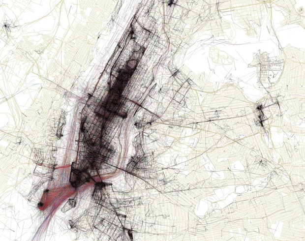
{Eric Fischer makes this city map art using Flickr geotags, article found on fastcompany}
These info graphic images of photo maps look tactile, like fine Washi papers from Japan. That is what caught my eye when I was checking out fastcompany.com for the latest in design. The geotags tell where people took photos in major cities of interest. Fischer showcases 50. He can even compare tourists habits with locals and the results are amazing. I just love how textured they look. Check out the article on fastcompany! To see them on Fischer's flickr click here.
To decode the web of points and lines:
black is walking
red: bicycling or equivalent speed
blue: local photos, motor vehicle or normal road use
red: tourists or people who took pictures here for a short time span
yellow: local or tourist status can't be determined
green: is freeway or rapid transit
If you zoom in on flickr, you can actually see so much more detail. The true algorithm is not divulged, but the visual is so intriguing. What do you think?
Labels:
abstract art,
Dom Miguel Photography,
Eric Fischer,
fastcompany,
flickr,
geotag,
maps
Monday, June 7
Modern House Numbers
I have been looking for new modern numbers for the front of my house and thought I would share a few of my favorites. Who knew there were so many great choices?
{L to R from the top: Neutra House Number from DWR, SoCal from modern house numbers, Letters and Numbers Window Film from brume, Backbay from modern house numbers, Sausalito house numbers from Chiasso, 4” Clarendon Medium from WestOn, Stainless House Signs from Adobe House Signs, 3” Ribbon from WestOn}
Sunday, June 6
Letter Heady
I was cleaning out my email inbox, as I often must do (I have a bad habit of letting a few thousand emails piling up - emails that I have read - without sorting them to their appropriate folders) and I happened to come across an email that I sent to myself. For those of you whom are smart-phone users, I'm sure you're familiar with this technique.
The email didn't say anything other than a web address and that was www.letterheady.com. I could have guessed but didn't expect that the website is devoted to famous, infamous, and interesting letterhead. I really recommend giving it a look. Most of the letterhead of late is very minimal and puts an emphasis on typeface and printing technique. I happen to like that style, personally, but seeing some of the full color and huge letterhead is really exciting. Here are a few examples, click through to check out the site!
This first letterhead that I've picked from Letterheady.com's site is an interesting one, for a railroad called "Carolwood Pacific." What's so interesting about a railroad? Well, for starters, this particular railroad was in Walt Disney's backyard and had track, cars, and locomotives about 1/8 the size of a "real" railroad. I had no idea such a whimsical thing existed. It amazes me that Walt not only had his own personal miniature railroad, but that he had stationery for it to boot!
This second piece is that of Frank L. Baum's, the creator of such stories as The Wizard of Oz. I had no idea that Baum was the futurist that he apparently was, as he predicted the development of laptop computers. I also didn't know that he was an apologist of the United States' policy of Manifest Destiny! I wouldn't have guessed that he held such an interesting place in a history much broader than the writing that we have come to know so well through Dorothy, Toto, and the Wizard. This letterhead is fascinating: like a few other examples, it's clear that letterhead developed into a strong C.V. statement for many individuals, and the usable writing area was reduced to a small fraction of the page.
This is the letterhead of the great mentalist, Joseph Dunninger, who was a contemporary of Houdini's and apparently well respected and liked in his field. He apparently supported efforts to debunk "magic" in favor of illusion and mentalism, reportedly working with Scientific American to "offer [$100,000] to any medium who could produce by psychic or supernatural means any physical phenomena that he cannot reproduce by natural means or explain in convincing materialistic terms."
He has a wonderful quote that is attributed to him, "For those who believe, no explanation is necessary; for those who do not believe, no explanation will suffice."
This last one, of course, needs no introduction! Can you imagine receiving a note on this stationery? Apparently, Dr. Seuss used this huge graphic to communicate with fans of his books. It would be interesting to see if anyone could produce an actual note from him!
Subscribe to:
Posts (Atom)