Showing posts with label design. Show all posts

Thursday, December 16

A Royal Wedding Gown

{Images from Top to Bottom: Vera Wang, Elizabeth Emanuel,  J.Crew, Jason Wu, Prabal Gurung, Rachel Roy, Tommy Hilfiger, Valentino, Badgley Mischka, Tory Burch and Christian Lacroix via AOL StyleList.}

Hello and happy Thursday, hope this finds you all well. I’m sort of giddy to share this post with you today because it combines a few of my favorite things; wedding dresses, fashion sketches and royalty! Oh my! These awesome sketches are from some of the world’s top fashion designers and feature designs for Kate Middleton’s royal wedding gown. Which one is your favorite? Mine is by far, the Tory Burch design, second to that, would be either the Vera Wang, or the J.Crew gown. Leave us a comment and let us know! I’m sure Kate would appreciate the input ;}

Monday, December 13

Veer Fonts

Still looking for a last minute holiday gift for the designer in your life? These two featured fonts from veer caught my eye, and would be more than welcome under my tree!


{L to R: Piel Script by Umbrella Type; Manicotti by Umbrella Type}

Friday, December 10

Contemporary Rituals

{image courtesy of danwitz.com}


Recently I discovered the incredible paintings of New York artist Dan Witz. Witz, a 30 year member of the street art scene, has been capturing the energy of contemporary gatherings in his series "Mosh Pits (Human & Otherwise)". Besides the obvious technical prowess of Witz's paintings, he captures the primal energy and aesthetic beauty of people locked in celebratory chaos that make you forget that the finely rendered participants are not actually moving on the surface. The Mosh Pit works explore the timeless human urge to create a shared experience where all pulses beat together.

Monday, November 8

The Embellished Bride


If you’ve been to eInvite.com recently, you’ve probably noticed that we have a new and exciting line of invitations called the Embellished Collection; featuring Swarovski crystals, hand-tied ribbons and layered papers. One of my favorite designs from the collection is this Serene Scrolled Border invitation, showcasing an elegant pattern of flourishes and scrolls in soft pewter gray, and adorned with a hand-tied, contemporary, black ribbon. The clean look and classic colors complement any style, and the soft green accents add a punch of color, that is both refreshing and fun. Be sure to check out the full collection here and peruse the many beautiful designs available...Enjoy and happy shopping!

Friday, July 30

Checkerboard Jewish New Year Cards!


Hello and happy Friday folks, today I wanted to remind you that eInvite is offering free printed return addresses on all Checkerboard Jewish New Year Cards. This promotion is currently running until the second of August but will be extended through to the 16th! Woohoo.

Of all of the beautiful Jewish New Year designs that Checkerboard has to offer, these are just a few of my favorites. If you would like to see the full selection, be sure to check them out here! There are plenty of wonderful designs to choose from…so, enjoy and happy shopping!

Monday, July 26

Nautical Inspiration

I love Erin's post on anchors and nautical inspiration! Elle Decor's recent feature on nautical interiors and accessories tempted me to post more on this fresh and relaxed style.

~ images from Elle Decor
~ invitation by Checkerboard on eInvite.com

Monday, June 7

Modern House Numbers

I have been looking for new modern numbers for the front of my house and thought I would share a few of my favorites. Who knew there were so many great choices?


{L to R from the top: Neutra House Number from DWR, SoCal from modern house numbers, Letters and Numbers Window Film from brume, Backbay from modern house numbers, Sausalito house numbers from Chiasso, 4” Clarendon Medium from WestOn, Stainless House Signs from Adobe House Signs, 3” Ribbon from WestOn}

Thursday, May 13

Pink Chandelier

Hello and happy Thursday friends! Today I wanted to remind you that eInvite is having a sale on all eInvite digital lithography cards until May 17th. There are hundreds of beautiful designs available at a great price, that are suitable for any occasion. I’ve featured here the lovely Pink Khandilir design which is perfect for either a rehearsal dinner, or even a bridal shower.
I absolutely adore the color pairing of a peachy pink with a subtle grey. The combination is feminine, yet cool and sophisticated and will help to turn any event into a classy affair. The chandelier motif is especially charming, since it lends a fun but elegant vibe to the announcement, making it perfect for a casual chic dinner party, or even a night out with the ladies. So, be sure to visit eInvite and check out the whole selection, perhaps you’ll find the perfect invite for your special event. Happy Shopping!

Thursday, April 15

Birds of Fancy


Hello fellow readers, I’ve got some good news for you on this beautiful sunny Thursday. You’ve still got four more days to snatch up a lovely wedding invitation for 25% off on eInvite.com, before the Spring Sale ends on April 19th! During the sale, we have about 44 select wedding designs to choose from, but I have to say, this Juliet invitation is probably my most favorite. I just love the tiny birds and the cheerful color combination of turquoise and emerald. In general, I think birds make for such a fun wedding theme. Not only are they romantic, but they’re whimsical and suggestive of nature, which makes them perfect for a back yard wedding, or a casual affair. Are you considering a bird theme for your wedding, or perhaps know someone who is? Well I’ve shown here, just a few ideas to inspire you…Enjoy!

Friday, April 9

Cherry Blossom Elegance


Hello and Happy Friday everyone! Today I’ve got a fresh breath of spring fever for you! Here on the east coast we were blessed with a beautiful week; full of sunshine, blue skies and warm breezes. Today however, it is rather grey and rainy, but my head is still filled with springtime lovliness. So, to keep the spirit alive, I thought I would share with you one of my favorite springtime sights…cherry blossoms!

There is just something so magical about walking along a cherry blossom lined sidewalk; with a canopy of beautiful pink flowers above ones head and below ones feet, it’s hard not to stop and appreciate nature’s beauty when doing so. Did you know that cherry blossoms are an omen of good fortune and are considered an emblem of love and affection? For this reason, I think they would make a wonderful theme and/or a beautiful backdrop for any wedding. Thinking about a cherry blossom themed wedding for you and your beu? Be sure to check out the lovely “Spring Cherry” invitation shown above. It is currently available on eInvite.com at 25% off until April 19th and would be the perfect introduction to such a wedding! Enjoy!

Monday, March 29

Abstract Expressionist Stamps

My grandfather was an avid collector of both stamps and coins, and as a kid, I remember spending hours browsing through his enormous collection. I have now inherited the stamp collection and although I rarely pull out the albums, each time the post office announces a new collection, I take it as a gentle reminder. I love the details in each tiny piece.


Abstract Expressionists stamps available through the US Post Office here.

Tuesday, March 16

Pretty Paper Cutting!

Artwork by Aoyama Hina. Invitations by Paper Orchid.

Just recently here at eInvite the Art department had its seasonal in-house trends review for Spring and Summer 2010. Among the many slides presented, there was one showcasing the artistic trend of paper cutting; widely known as Scherenschnitte. After the presentation, our Art Director commented that the slide reminded her of our Paper Orchid line on eInvite. So, to give you a sense for this amazing craft, I’ve shown here, a sampling of some of Paper Orchid's Invitations alongside the beautiful work of Aoyama Hina; a renowned Japanese artist living in France. And although the Paper Orchid designs are laser cut, not hand cut, as are Hina’s designs, their appearance certainly references this fine craft. So, if you’re looking for a touch of artistry in your invitations, Paper Orchid is a great option, be sure to check out more of the designs here on eInvite. Enjoy!

Thursday, March 11

Decadent Champagne and Black

Images courtesy of 100 Layer Cake, Twigs & Honey and Weddingistas.

Hello and happy Thursday! Today I've got another fabulous color combination for you. Remember last week's Shimmering Pink and Gold pairing? Well this week, it's decadent champagne and black! I just love this classic combination; it maintains that timeless feel of black and white, but with a glint of glamour. The warm shimmer of the champagne, offsets the bold black just beautifully, and makes a truly elegant ensemble that is perfect for any wedding! What’s even more beautiful is that eInvite is currently offering 40% off this Champagne Decadence invitation for a limited time. So, be sure to head over to eInvite.com and check it out! It’s a decadent deal…

Friday, March 5

Shimmering Pink & Gold


Hello and Happy Friday! Today, I've got some perfectly pink eye candy for you to start your weekend with! How beautiful is this color combination of pink and gold? The pairing of a feminine pink with a burnished gold sets a sophisticated tone that is both lovely and lush. And fortunately, for the budget conscious bride, eInvite is currently offering 40% off this Shimmering Meadow invitation for a limited time. Be sure to head over to eInvite.com and check it out! It's a beautiful bargain...

Monday, February 15

Daily Drop Cap

A few weeks back I was smitten with the 300&65 Ampersands project. Equally as engaging, is the Daily Drop Cap project by illustrator Jessica Hische, which features an illustrative initial each day. You are free to use the drop caps on your website or blog (within limitations). How fun!

Sunday, February 14

2010 Vancouver Olympics and Design

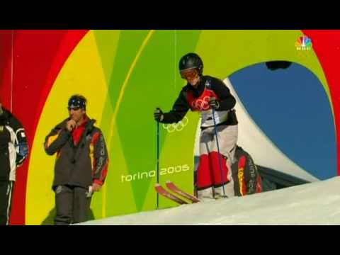
I have been watching the Olympics off and on, and had the chance to catch one of my favorite events, Freestyle (moguls). As I watched, I noticed the U.S. Freestyle team's suits. Freestyle outfits are designed to intentionally showcase the knees and minimize the torso, because the upper body should travel calmly and the knees should be positioned together and show the movement of the skier's legs and ski-tips (a significant portion of an athlete's score is derived from style).

The torso is higher and therefore more easily seen by the judges. As a result, in order to draw the eye downward, bright patches are placed over the knees, and solids tend to cover the torso. I was very surprised at how utilitarian the U.S. team's suits were. They were not particularly good looking, and functionally achieved their purpose (you noticed the knees and didn't focus on the torso). They looked a bit like they were wearing pajamas in royal blue with star print.


Hannah Kearney wins gold (Photo: Streeter Lecka / Getty Images via USSkiteam.com)

This lack of flair (in the suits - the skiers themselves compensated magnificently) made me wonder if perhaps the design had been significantly influenced by the economic morass in the United States. Is our collective emotional state influencing our cultural representation? Ralph Lauren designed the ready-to-wear collection that you see U.S. Olympians wearing on the podium, and this sort of pattern does remind me a bit of his style, but I could not find if he was responsible or not.

What do you think? Is our stoic presentation due to our current economic environment? Or do you think that the design above is just as bombastic as previous U.S. Olympic designs? See below:


I feel like our presentation on the world stage is a reflection of our emotional state as a country (and I couldn't help but overhear my compatriots this weekend remarking about the lackluster economy and the rising Chinese star). It's fascinating to think of a cultural subconscious having such an effect on art and design.

Monday, February 8

Fabric Inspiration

Marimekko fabrics are some of my favorite textiles. On trend but still quite unique, I am captivated by their use of pattern. Below are a few of my current favorites. Wouldn’t this make an amazing quilt?


Friday, February 5

Drawing with Paper

{image courtesy of simonschubert.de}
Ghostly interiors and architectural renderings by Simon Schubert created by folding and manually embossing white sheets of paper. These amazing works brilliantly use the paper itself to model light effects and details and shows how ingenuity can redefine the concept of drawing.

Design for Joy

I wanted to share some touching design inspiration - The Dream Ball project by Unplugdesign. These aid boxes are designed to bring joy to poor children in countries struck by war, poverty and natural distater. The boxes are designed to easily be recycled into footballs that these children can play with. This recyled box can bring a world of joy to a child who loves to play but cannot afford to buy a football.
Read more and view on Unplugdesign.


Monday, January 18

Typography in Advertising

I recently came across an article featuring great typography in advertising. Here are a few examples, but the entire article is worth checking out on noupe.


{Everlast}


{Toyota}


{Stowe}